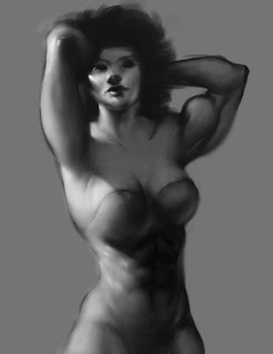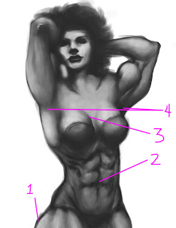
 I had some thoughts about your paintings, Vo, and took a few moments to make some notations in photoshop.
 I think the largest issue here is one of lighting. The image has no real light source and, consequently, lives in realm between 2D and 3D. Examination of the details - individual muscles, etc - reveals a suggestion of 3D that works in a convincing way, but stepping back and taking in the entire image has a very different impact, one that is flat. My suggestion is to establish a light direction to give your image an overall 3D effect, as well as enhance drama through contrast.
In addition to this large suggestion, I've made 4 changes to smaller, more technical issues:
- No one has ever accused me of knowing my anatomy, but the muscle on the thigh here seems too large (although my version may be a too small).
- The abs are too chiselled. She's wearing a bathing suit, but even if she weren't they'd still have that problem of looking a bit like they're carved into a totem pole rather than a naturalistic feeling of skin over muscle.
- The transition of the bosom is too extreme, like spheres glued onto a surface.
- The left armpit is too low, she's tilting in the opposite direction as her armpits.
WOW!!! Thanks Bruce! this was oringally just a quick sketch so I didn't think of light source... After seeing your revision and how just putting a simple light source can change the overall image I will be more aware of playing with lighting :)
ReplyDelete