
Sunday, June 7, 2009
Thursday, May 7, 2009

Wednesday, March 11, 2009

Tuesday, March 10, 2009

Friday, March 6, 2009

Thursday, March 5, 2009


Wednesday, March 4, 2009
Dominance War Mini _War General Portaits

Thursday, February 26, 2009
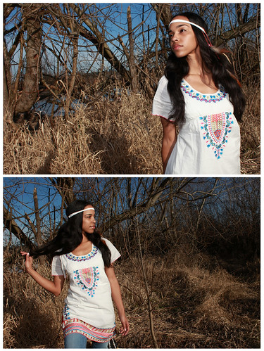
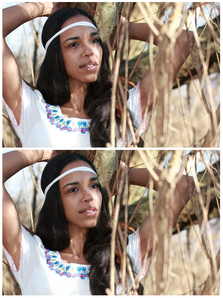
I don't have any recent drawings to post, but I do have photos. These are from a photoshoot on Saturday and the model's name is Terry.
And just so it's kind of art related, here's a before and after Photoshop:

There's a bigger version here so you can see the details better:
http://farm4.static.flickr.com/3557/3310285177_df203f9cbc_o.jpg
-Diana
And just so it's kind of art related, here's a before and after Photoshop:
There's a bigger version here so you can see the details better:
http://farm4.static.flickr.com/3557/3310285177_df203f9cbc_o.jpg
-Diana


Thursday, February 19, 2009


Sunday, February 15, 2009
self-portrait
 started as a self-portrait, and then ending up messing around. spent about 2hr total.
it was a great practice.
2d mini: Baby Movie Monsters
 I created this image for the 2d mini comp on GameArtisans. i chose the monster for the cloverfield. spent about 8hr on it.
Friday, February 13, 2009

 I had some thoughts about your paintings, Vo, and took a few moments to make some notations in photoshop.
 I think the largest issue here is one of lighting. The image has no real light source and, consequently, lives in realm between 2D and 3D. Examination of the details - individual muscles, etc - reveals a suggestion of 3D that works in a convincing way, but stepping back and taking in the entire image has a very different impact, one that is flat. My suggestion is to establish a light direction to give your image an overall 3D effect, as well as enhance drama through contrast.
In addition to this large suggestion, I've made 4 changes to smaller, more technical issues:
- No one has ever accused me of knowing my anatomy, but the muscle on the thigh here seems too large (although my version may be a too small).
- The abs are too chiselled. She's wearing a bathing suit, but even if she weren't they'd still have that problem of looking a bit like they're carved into a totem pole rather than a naturalistic feeling of skin over muscle.
- The transition of the bosom is too extreme, like spheres glued onto a surface.
- The left armpit is too low, she's tilting in the opposite direction as her armpits.
Subscribe to:
Posts (Atom)